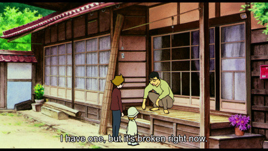
#Examples of desktop computer
Explore tagged Tumblr posts
Visit Tumblr Blog
Explore Tumblr blogs with no restrictions, modern design and the best experience.
Last Seen Tumblr Blogs


Fun Fact
Tumblr.com is the 103rd most visited website in the world.
Text


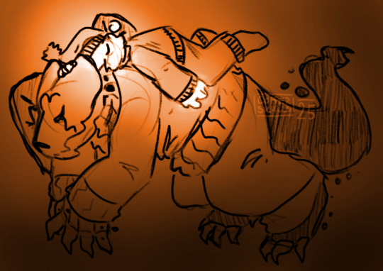

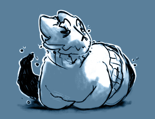

Ey-yo, my commissions are open, starting at 15EUR for sketches & simple things! If you'd be interested, reach out and I'll figure out a price for you! i specialize in Beasts and Dragons but willing to try my hand at pretty much anything.
No content above suggestive, but I'm fine with about any degree of gore with the exception of eye & nail trauma.
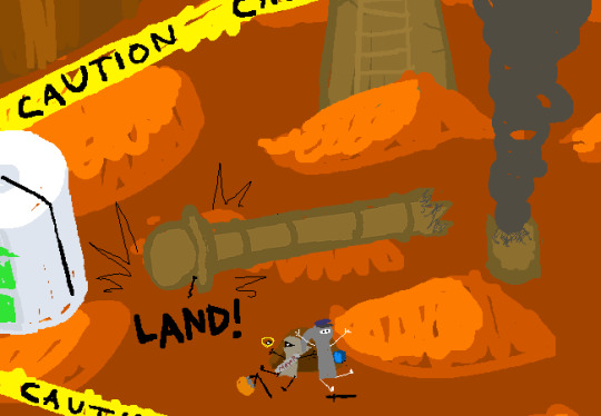
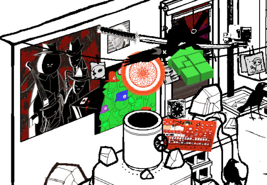
#okay NOW this is a commission post with actual examples sorry#i will go clear out all my old comm posts... eventually#gave up on making a price chart. because complexities are different. that's it I give up on making a damn chart#as always commissions are my fun money#but I wanna play... mined craft.#and it's starting to look i'd need to completely gut my old desktop tower possibly to do that#so uh. computer fund. if I manage to get it working without needing a new one then nuthatch tattoo fund#i wish i could have two pinned but I like the org one is . better#so this one will get rbd alot#sowwy#commissions
44 notes
·
View notes
Text

light/yamamoto rarepair to niggle your brain. yamamoto only sends cards to girls........ light.... why of all people to ask affection from you asked in a deliberately gendered way and from your male friend...........
#im having SO much fun reading#there are quite a few details people never bothered to investigate#for example the knonchandv.mov file in watari's computer desktop
106 notes
·
View notes
Text
i think the thing is that it really depends on what they’re used to and what their needs are for it
like even setting aside uses other than as their primary and only desktop OS, some examples that might give some very different recommendations:
soon-to-be-former mac user looking for a similarly pretty user experience
a soon-to-be-former windows user who just wants buttons in the same place as windows and things to generally function the same
wishes the buttons were smaller and everything was accessible with a single press keyboard shortcut
a gamer who uses it almost exclusively for games
someone who just browses the web and uses web apps for document editing
a developer with some experience with using a *nix shell and maybe deploys code to docker containers that run linux (what distro they use for that might affect a recommendation)
someone trying to stretch life out of a dying, old computer
someone with cutting edge components that need to be supported fast
someone who cares deeply about everything being FOSS
someone who just wants it to work stably at all costs
someone whose primary goal of switching is to tinker more
now i haven’t been in the distro-recommending game for some years so idk what i’d recommend for all of those but they all affect things heavily
Friend said they're interested in using linux. target acquired.
#if anyone wants to recommend some for various examples above that could be useful to somebody who sees this at some point#funny also saying all of this and i don’t even use desktop linux anymore. it just doesn’t fit anywhere in my life currently.#like i use my personal computers for ios development and gaming#and i don’t spend like any time on them except occasional web browser usage#so like i just want them to take care of themselves with updates and stuff and have everything keep working#and at work i can only use windows or macos for my desktop os (but use linux constantly in containers)#and my nas runs ubuntu server bc that’s what i used when i first switched to linux and so it was easier to set up without a hassle#but i used debian for the longest time when i did use it as a desktop os#and a few smaller ones i tried out for bits of time#and i tried arch at one point but it’s not for me (or at least wasn’t at the time)#sabrina says
90 notes
·
View notes
Note
Hello! First, I wanted to say thank you for your post about updating software and such. I really appreciated your perspective as someone with ADHD. The way you described your experiences with software frustration was IDENTICAL to my experience, so your post made a lot of sense to me.
Second, (and I hope my question isn't bothering you lol) would you mind explaining why it's important to update/adopt the new software? Like, why isn't there an option that doesn't involve constantly adopting new things? I understand why they'd need to fix stuff like functional bugs/make it compatible with new tech, but is it really necessary to change the user side of things as well?
Sorry if those are stupid questions or they're A Lot for a tumblr rando to ask, I'd just really like to understand because I think it would make it easier to get myself to adopt new stuff if I understand why it's necessary, and the other folks I know that know about computers don't really seem to understand the experience.
Thank you so much again for sharing your wisdom!!
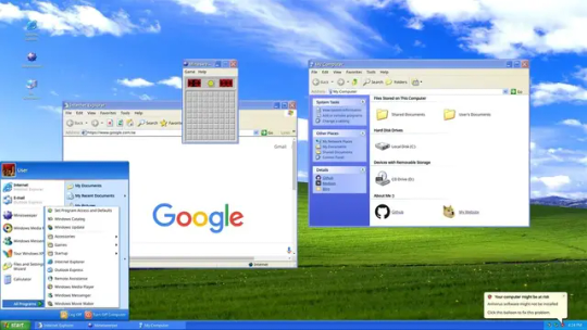
A huge part of it is changing technologies and changing norms; I brought up Windows 8 in that other post and Win8 is a *great* example of user experience changing to match hardware, just in a situation that was an enormous mismatch with the market.
Win8's much-beloathed tiles came about because Microsoft seemed to be anticipating a massive pivot to tablet PCs in nearly all applications. The welcome screen was designed to be friendly to people who were using handheld touchscreens who could tap through various options, and it was meant to require more scrolling and less use of a keyboard.
But most people who the operating system went out to *didn't* have touchscreen tablets or laptops, they had a desktop computer with a mouse and a keyboard.
When that was released, it was Microsoft attempting to keep up with (or anticipate) market trends - they wanted something that was like "the iPad for Microsoft" so Windows 8 was meant to go with Microsoft Surface tablets.
We spent the first month of Win8's launch making it look like Windows 7 for our customers.
You can see the same thing with the centered taskbar on Windows 11; that's very clearly supposed to mimic the dock on apple computers (only you can't pin it anywhere but the bottom of the screen, which sucks).
Some of the visual changes are just trends and various companies trying to keep up with one another.
With software like Adobe I think it's probably based on customer data. The tool layout and the menu dropdowns are likely based on what people are actually looking for, and change based on what other tools people are using. That's likely true for most programs you use - the menu bar at the top of the screen in Word is populated with the options that people use the most; if a function you used to click on all the time is now buried, there's a possibility that people use it less these days for any number of reasons. (I'm currently being driven mildly insane by Teams moving the "attach file" button under a "more" menu instead of as an icon next to the "send message" button, and what this tells me is either that more users are putting emojis in their messages than attachments, or microsoft WANTS people to put more emojis than messages in their attachments).
But focusing on the operating system, since that's the big one:
The thing about OSs is that you interact with them so frequently that any little change seems massive and you get REALLY frustrated when you have to deal with that, but version-to-version most OSs don't change all that much visually and they also don't get released all that frequently. I've been working with windows machines for twelve years and in that time the only OSs that Microsoft has released were 8, 10, and 11. That's only about one OS every four years, which just is not that many. There was a big visual change in the interface between 7 and 8 (and 8 and 8.1, which is more of a 'panicked backing away' than a full release), but otherwise, realistically, Windows 11 still looks a lot like XP.

The second one is a screenshot of my actual computer. The only change I've made to the display is to pin the taskbar to the left side instead of keeping it centered and to fuck around a bit with the colors in the display customization. I haven't added any plugins or tools to get it to look different.
This is actually a pretty good demonstration of things changing based on user behavior too - XP didn't come with a search field in the task bar or the start menu, but later versions of Windows OSs did, because users had gotten used to searching things more in their phones and browsers, so then they learned to search things on their computers.
There are definitely nefarious reasons that software manufacturers change their interfaces. Microsoft has included ads in home versions of their OS and pushed searches through the Microsoft store since Windows 10, as one example. That's shitty and I think it's worthwhile to find the time to shut that down (and to kill various assistants and background tools and stop a lot of stuff that runs at startup).
But if you didn't have any changes, you wouldn't have any changes. I think it's handy to have a search field in the taskbar. I find "settings" (which is newer than control panel) easier to navigate than "control panel." Some of the stuff that got added over time is *good* from a user perspective - you can see that there's a little stopwatch pinned at the bottom of my screen; that's a tool I use daily that wasn't included in previous versions of the OS. I'm glad it got added, even if I'm kind of bummed that my Windows OS doesn't come with Spider Solitaire anymore.
One thing that's helpful to think about when considering software is that nobody *wants* to make clunky, unusable software. People want their software to run well, with few problems, and they want users to like it so that they don't call corporate and kick up a fuss.
When you see these kinds of changes to the user experience, it often reflects something that *you* may not want, but that is desirable to a *LOT* of other people. The primary example I can think of here is trackpad scrolling direction; at some point it became common for trackpads to scroll in the opposite direction that they used to; now the default direction is the one that feels wrong to me, because I grew up scrolling with a mouse, not a screen. People who grew up scrolling on a screen seem to feel that the new direction is a lot more intuitive, so it's the default. Thankfully, that's a setting that's easy to change, so it's a change that I make every time I come across it, but the change was made for a sensible reason, even if that reason was opaque to me at the time I stumbled across it and continues to irritate me to this day.
I don't know. I don't want to defend Windows all that much here because I fucking hate Microsoft and definitely prefer using Linux when I'm not at work or using programs that I don't have on Linux. But the thing is that you'll see changes with Linux releases as well.
I wouldn't mind finding a tool that made my desktop look 100% like Windows 95, that would be fun. But we'd probably all be really frustrated if there hadn't been any interface improvements changes since MS-DOS (and people have DEFINITELY been complaining about UX changes at least since then).
Like, I talk about this in terms of backward compatibility sometimes. A lot of people are frustrated that their old computers can't run new software well, and that new computers use so many resources. But the flipside of that is that pretty much nobody wants mobile internet to work the way that it did in 2004 or computers to act the way they did in 1984.
Like. People don't think about it much these days but the "windows" of the Windows Operating system represented a massive change to how people interacted with their computers that plenty of people hated and found unintuitive.
(also take some time to think about the little changes that have happened that you've appreciated or maybe didn't even notice. I used to hate the squiggly line under misspelled words but now I see the utility. Predictive text seems like new technology to me but it's really handy for a lot of people. Right clicking is a UX innovation. Sometimes you have to take the centered task bar in exchange for the built-in timer deck; sometimes you have to lose color-coded files in exchange for a right click.)
296 notes
·
View notes
Note
Hey how do you do the color gradient thing for your dialog tags?
Assuming you mean these things, I've actually been meaning to make a guide of my own for a while lol.
For one, you can only do this on computer/the website of Tumblr! There's no option to select this stuff on the app.

STEP 1: CREATE A NEW DOC / GO TO SETTINGS

It opens a dropdown menu/whole screen full of options!
From there, select the "text editor" dropdown, which starts as displaying "rich text".

Select "HTML"

And it should change how the entire post looks!

STEP TWO: CHEAT
Yeeeeeaaaaah, so I use a website for this lol

I inserted my colors for faeries (#30853C) and Cloud (#6DC1B4) for my example of "these things" earlier. To make this easier, I most often have two windows open at a time while working on uploading my scripts to Tumblr.

To get colours to insert into the Text Colorizer website, you can use any kind of hex color picker or even this one website I've used to yoink "thematic" colors from photos!


Personally, I've developed a massive library of colors over time for this exact purpose lol. Using my old colors as a "base", I can change it accordingly to the kind of "new color" that I want for a specific character or thing!


(I'll use the website to also make gradients for "in-between" colors lol)
STEP 3: INSERT TEXT / DESIRED COLORS
To make Nova's gradient, I start with #A600D9, my color for Magic, and end with #F56745—their individual color. However, being as it's short, I'll use a quote from them instead lol.

Once you've inserted your text and colors, you will click in the text box I highlighted in red, ctrl+a and ctrl+c to copy it all, and go back over to your new tumblr post tab!
From there, you'll ctrl+v to paste the entirety into the HTML area, which pastes the code into your post!

AND VOILA!

You have gorgeous gradient text!
However, I want to give a fair warning and a bit of advice! If you didn't notice wayyyyyyy back when...

Tumblr warns that this all can break your formatting!
It doesn't do it too often, but take it from someone who does an obscene amount of formatting... it's 100% true.
STEP 4: CHEAT SOME MORE!
For this reason, I personally have a whole separate draft post full of my characters' colors (and names lol) that I use to copy-paste them in from rather than using the "html" text editor on every post!
I mentioned earlier I often have multiple windows open while editing? Here's what that looks like!

Additionally, I'll use a separate tab off on the left (my "current wip post" side) with the "html editor" enabled for me to copy-paste stuff!
(Also here's yet another example of how many colors I have)

Once again, you can ctrl+c these things to paste them into another tumblr post with the correct colors!
And it's ONLY possible to do on the website!!!
EXTRA INFO!
WARNING:
Tumblr will only allow each "paragraph's html to be so many characters long, so you can't have too big of anything in a gradient!

And by "anything"... I mean you really can't have that big of a gradient in general. RIP lol.
It straight-up won't save the post so long as you have that "overflow" in the character block! MAKE SURE YOU'VE FIXED IT, OR YOU CAN AND WILL LOSE ALL PROGRESS ON YOUR POST!
SINGLE-COLOR TIP:
You don't need the website for a single color! If you'd like, you can just change the "color code" within the html editor to change specific colors!

MAKE SURE COLORS CAN WORK ON DIFFERENT BACKGROUNDS!
On desktop, you can use shift+p while not on any sort of textbox to change the color pallet! I always do tests to see which colors work best before settling on any!

(Tho, the blue background SPECIFICALLY is nightmarish to work around. So if that's the ONLY thing I can't make work, I often ignore it and let you guys who use it suffer lmao)
(Hopefully this'll give you guys some respect for me and how much I do to make my posts aesthetic af lol)
Also hopefully this all helps???
divider by @cafekitsune
73 notes
·
View notes
Text
The main reason to use Firefox and Linux and other free and open source software is that otherwise the big tech monopolies will fuck you as the customer over in search of profits. They will seek to control how you use their products and sell your data. When a company dominates the market, things can only get worse for ordinary people.
Like take Google Chrome for example, which together with its chromium reskins dominate the web browser market. Google makes a lot of money from ads, and consequently the company hates adblockers. They already are planning to move to manifest V3, which will nerf adblockers significantly. The manifest V3 compatible chrome version of Ublock Orgin is a "Lite" version for a reason. Ublock's Github page has an entire page explaining why the addon works best in Firefox.
And Google as we speak are trying to block adblockers from working on Youtube, If you want to continue blocking Youtube ads, and since Youtube ads make the site unuseable you ought to want that, it makes the most sense to not use a browser controlled by Google.
And there is no reason to think things won't get worse. There is for example nothing stopping Google from kicking adblockers off their add-on stores completely. They do regard it as basically piracy if the youtube pop-ups tell us anything, so updating the Chrome extensions terms of service to ban adblocking is a natural step. And so many people seem to think Chrome is the only browser that exists, so they are not going to switch to alternatives, or if they do, they will switch to another chrominum-based browser.
And again, they are fucking chromium itself for adblockers with Manifest V3, so only Firefox remains as a viable alternative. It's the only alternative to letting Google control the internet.
And Microsoft is the same thing. I posted before about their plans to move Windows increasingly into the cloud. This already exists for corporate customers, as Windows 365. And a version for ordinary users is probably not far off. It might not be the only version of Windows for awhile, the lack of solid internet access for a good part of the Earth's population will prevent it. But you'll probably see cheap very low-spec chromebookesque laptops running Windows for sale soon, that gets around Windows 11's obscene system requirements by their Windows being a cloud-based version.
And more and more of Windows will require Internet access or validation for DRM reasons if nothing else. Subscription fees instead of a one-time license are also likely. It will just be Windows moving in the direction Microsoft Office has already gone.
There is nothing preventing this, because again on the desktop/laptop market Windows is effectively a monopoly, or a duopoly with Apple. So there is no competition preventing Microsoft from exercising control over Windows users in the vein of Apple.
For example, Microsoft making Windows a walled garden by only permitting programs to be installed from the Microsoft Store probably isn't far off. This already exists for Win10 and 11, it's called S-mode. There seem to be more and more laptops being sold with Windows S-mode as the default.
Now it's not the only option, and you can turn it off with some tinkering, but there is really nothing stopping Microsoft from making it the only way of using Windows. And customers will probably accept it, because again the main competition is Apple where the walled garden has been the default for decades.
Customers have already accepted all sorts of bad things from Microsoft, because again Windows is a near-monopoly, and Apple and Google are even worse. That’s why there has been no major negative reaction to how Windows has increasingly spies on its users.
Another thing is how the system requirements for Windows seem to grow almost exponentially with each edition, making still perfectly useable computers unable to run the new edition. And Windows 11 is the worst yet. Like it's hard to get the numbers of how many computers running Win10 can't upgrade to Win11, but it's probably the majority of them, at least 55% or maybe even 75%. This has the effect of Windows users abandoning still perfectly useable hardware and buying new computers, creating more e-waste.
For Windows users, the alternative Windows gives them is to buy a new computer or get another operating system, and inertia pushes them towards buying another computer to keep using Windows. This is good for Windows and the hardware manufacturers selling computers with Windows 11 pre-installed, they get to profit off people buying Windows 11 keys and new computers, while the end-users have to pay, as does the environment. It’s planned obsolescence.
And it doesn’t have to be like that. Linux distros prove that you can have a modern operating system that has far lower hardware requirements. Even the most resource taxing Linux distros, like for example Ubuntu running the Gnome desktop, have far more modest system requirements than modern Windows. And you can always install lightweight Linux Distros that often have very low system requirements. One I have used is Antix. The ballooning Windows system requirements comes across as pure bloat on Microsoft’s part.
Now neither Linux or Firefox are perfect. Free and open source software don’t have a lot of the polish that comes with the proprietary products of major corporations. And being in competition with technology monopolies does have its drawbacks. The lacking website compatibility with Firefox and game compatibility with Linux are two obvious examples.
Yet Firefox and Linux have the capacity to grow, to become better. Being open source helps. Even if Firefox falls, developers can create a fork of it. If a Linux distro is not to your taste, there is usually another one. Whereas Windows and Chrome will only get worse as they will continue to abuse their monopolistic powers over the tech market.
846 notes
·
View notes
Text
The sibling energy starting off this movie I am dying for. Hikari is such a troll; I love her.
I want! The little notice and delivery message is so goddamn cute. Early 2000s web and mail pages whiplash tho.
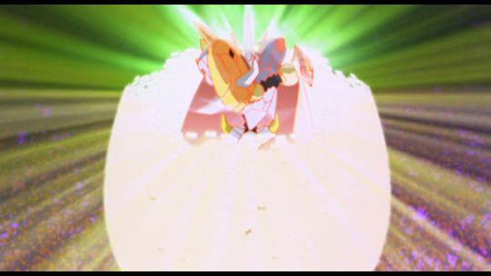
Egg!
I will never not laugh at this dumb joke. Doesn't matter the language or anything else. Whenever I see it I'm just like "egg!" Makes me think of Tamagotchi too.
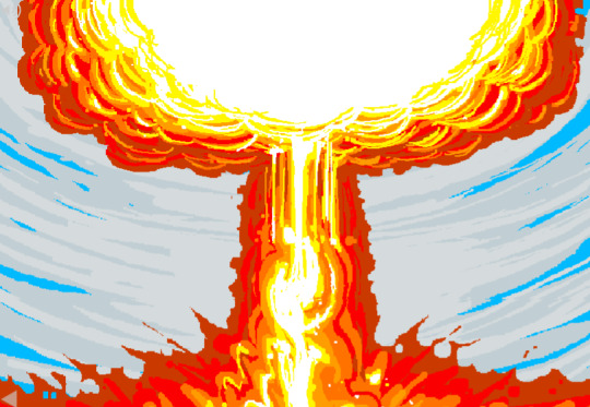
A nuke destroying the credits is morbid as hell. My first reaction seeing the Japanese credits was ...okay then. lmao.
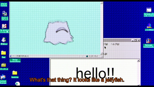
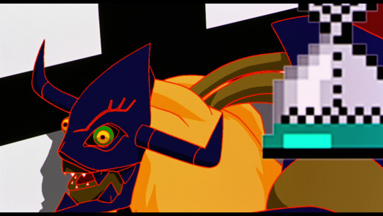
Kuramon is so cute. A little gremlin in disguise but so cute. I like how they compare it to a jellyfish... and continue refer them as a jellyfish even as I will call Infermon and Diablomon more of a spider with the spindly legs (not enough of them, first thought is still spider though).
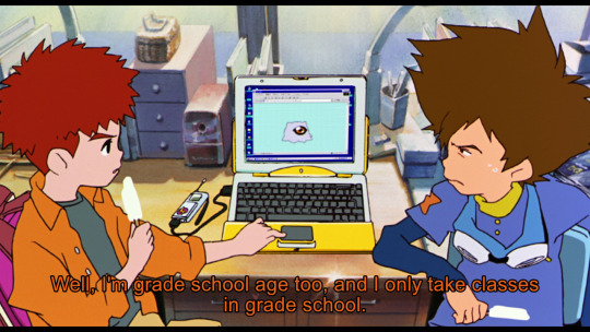
The desktop layout and everything is sure taking me back to my childhood. I love depending on the program or file he has a bilingual desktop
...IS THAT NETSCAPE?!
Taichi, there's no reason to be jealous of Koushiro's penpal. The first person Koushiro decided to come to was you, chill. lol. They're such silly beans.
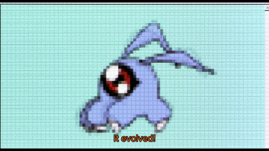
TSUMEMON MY BABY!! I love you lil' one so much, even if the anime gives you the least amount of time to shine. (this is literally it for this movie. Kuramon is everywhere is the whole point next time around. I may be a little bitter as it is my favorite stage and favorite lil' lil' guy, but I still enjoy the other evos)
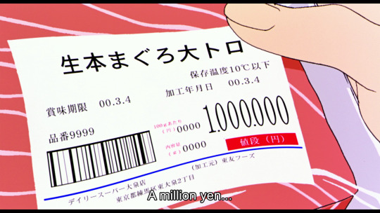
I get the POS failing at the cash registers, but I always found it a bit weird that the prices for already printed barcodes and labels are changed when they're not connected to the internet? They are printed; they are done, how? Unless they are implying they've been labeled in the last few minutes or something else.

So begins a long game of phone tag.

Koushiro silently judging his friends for not being able to communicate.
It could be like an old battle screen or menu for a game ❤️
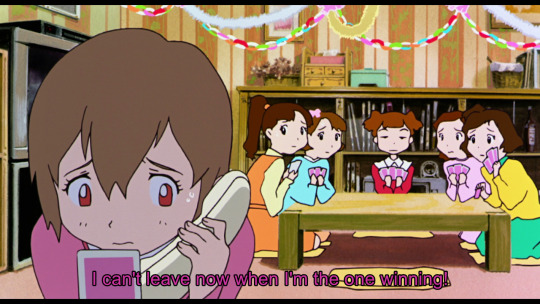
I love the impression that if Hikari was losing she would have taken the out. "Yeah, bro, I'm losing bad, I'll come home when I can." That would be out of character for her, but it is funny to think about.
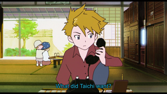
So continues the game of phone tag.
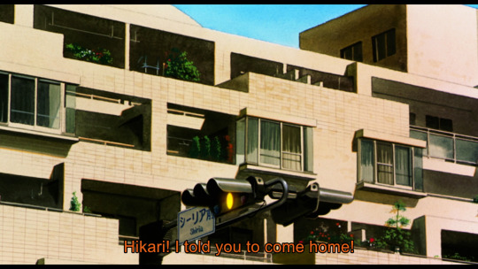
Taichi not being straightforward with Hikari. I'm like... you could have tried "it's urgent and people are in danger;" or "you'll get to see Tailmon again;" or anything really that is not sounding like a bossy older brother demanding her to ditch her friend's birthday party. Find better leads for the conversation next time XD.
My guys trying so hard to find a working computer, and they almost hit the mark right off the back. Nope, nope... no.
No, no! Koushiro, do not fall for empty stomach. You are going to get distracted, and then you are going to regret it!
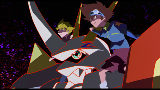
Infermon is such a troll. I didn't recognize I took a screencap while the sign was spinning upside down, but here we are. Another thing is that adds a lot of character is communicating mostly through electronical text messages (makes the phone call creepier, which I would have included if I had room).
A single motionless frame is hard to give as an example saying I like the animation in this movie, so I picked two that conveyed motion the best I could.
It's okay, little one. Next movie you'll get to spread your wings 👼.
Not to say I told you so, but I told you so.
I would say this is why you don't thump computers. I won't though (with any heat at least), poor kid is about to have a heart attack.
LMAO, HOW?!?
BBY SPOTTED!
Also damn Miyako hit a growth spurt in the next couple years. Girl is tiny.
*wonders in befuddlement once more why Adventure 2020 started with Our War Game when it can not hit these feels on the basis of being an introduction and not a sequel, which the original movie was* (I do actually like the start of 2020 reboot but I am much confusion)
That said... *rips heart out, steps on it* That feeling almost equates here.
LET'S FUCKING GOOOOOO!!!!!!
This is such a 2000s movie. The antagonist being beaten by poor internet speeds and influx of hundreds of thousands of spam mail. I love it so, so much.

If you didn't make it, you would already be dead.
Unless I keep on missing it, they never clarify/know that Odaiba is ground zero in the original. They mention they can't guess the trajectory or where it's going to land until... it happens. That would be heartbreaking. For the audience in a tragedy. Everyone at ground zero would already be dead.
I'm pretty sure neutralizing a nuke isn't as simple as they have it, but I'll let it slide. I love this movie. I don't want precious kids (and countless people) dead, so it's fine.
Thank you for sticking with my meme-y long posts. I like that 54 episodes + movie easily are divided into weekdays over a couple months. If you don't care, well, you probably aren't seeing or reading this far so... XD
I will likely do a post about when I'll start 02 posts (the season itself I am almost done with watching). I know I'll be taking a break but still should start this summer.
👋
#digimon#digimon adventure 01#aly's digimon rewatch adventure#digimon our war game#taichi yagami#tai kamiya#koushiro izumi#izzy izumi#yamato ishida#matt ishida#hikari yagami#kari kamiya#takeru takaishi#tk takaishi#infermon#omegamon#omnimon#kuramon#tsumemon#diablomon#diaboromon#miyako inoue#yolei inoue#my stuff#long post#i was a little rushed editing these so had no time to figure out the ratio#to get rid of little black bars so they're stuck there#digimon adventure (movie) was at 16:9 and I didn't have a problem with those screencaps#oh well here we go
48 notes
·
View notes
Text
how not having a phone impacted my day-to-day, in case anyone's considered having a retro-style no-phone/flip phone summer:
social obligations:
less pressure to constantly respond to texts
unable to respond to texts sent on imessage
missing a lot of the cool apple features (gamepigeon, reacts, animations, stickers, etc)
need to keep several tabs open on the computer to monitor any urgent messages that might be sent over discord, Instagram, or email
can't use the Remind app or a lot of productivity apps because they're not available as a desktop version on locked Chromebooks
productivity:
I can't bring my phone to bed, I've started sleeping much earlier
my headaches have reduced since text on my laptop tends to be larger than text on my phone (and I can't read documents on my laptop in moving vehicles, which was also causing pretty bad headaches)
I don't think it's made TOO much of an impact on how I spend my time, but I have found myself scrolling on TikTok less because the swipe feature is so laggy on my Chromebook
quality of work:
as you might have noticed, the image quality on my blog tends to be very skewed. this is because I take half of my pictures through my desktop camera, and the other half through my DSLR.
a lot more intention behind everything I do (for example, when I post a picture on Tumblr, I need to pull out the DSLR, frame the picture nicely, transfer everything onto an old laptop with an SD reader, download to drive, then upload onto the app. I find myself planning my shots a lot more carefully and like to take several photos in one session)
overall state of mind
it definitely increased my personal satisfaction with my work and made me feel more accomplished
added workload for a lot of things I didn't even think about when I had a phone (again, taking pictures, transferring files, sharing things with people on the go)
I find myself unable to check the time or do tasks while walking across my school campus, which is frustrating when I need to write a note to myself
in a similar vein, I find myself thinking a lot more about how I will organize my time in the future or trying to recall concepts during short breaks where it doesn't make sense to pull out my laptop. this gets me into a productive mindset and I usually have a better time working on myself and having a positive outlook
people are constantly shocked that I don't have a phone. Many of my teachers have a "phone in the bin" policy for their classes, so they checked my bag pretty regularly in the early days because they were skeptical about the validity of my claim of not having a phone at all
i feel like I definitely had an addiction, and being able to get off of it was really helpful for my self-confidence and ability to overcome challenges
overall, I would really recommend at least trying to get off of your phone for like a week or two if you can! if it doesn't work for you, it doesn't work for you. If it works, it works. Giving it a shot probably wouldn't hurt imo. I'm honestly planning to just get myself a flip phone for emergencies because I really like the feeling of not having a guaranteed way to pass time and instead having to come up with things to do myself :D
#journal#study#studyblr#study motivation#studyinspo#studyspo#chaotic academia#student life#honest academia#realistic studyblr#productivity#productivity challenge#productivitytips#university#student#learning#self improvement#tips#creativity#cleanse#dark academia#no phone summer#flip phone summer#physical media#2000's#2010's#2010s nostalgia#summer#summer 2025#unplugandreconnect
33 notes
·
View notes
Text
I'm curious, and have heard things about the younger generations, Gen Zs and especially Gen Alphas, not receiving as much education or lessons on how to use computers (as in desktop/PCs or laptops) beyond the basics, or internet safety and etiquette. No idea if this is true or not. So poll time!!
In this, I'm asking about if you received, or are receiving, actual, official lessons/classes on both internet safety/etiquette and how to use computers beyond the bare basics. For example, in school my class had dedicated lessons for both of these, that included signing up to educational sites that mimicked social media so we could learn how to navigate them in a monitored environment.
And to avoid any confusion, the generation categories are:
Gen X: 1965-1980
Millennials: 1981-1996
Gen Z: 1997-2012
Gen Alpha: 2010s-2025
575 notes
·
View notes
Text
my mom was so jokingly evil sometimes. i always talk abt how perfect she was but she was also like. a crazy little sister and that part of her personality never went away. for example: when i was like 10 or so i FINALLY started sleeping in my own bed (my poor mother put up with me for so long) because when i was little i was too scared of the dark to sleep alone. so i finally get over it to a degree and one day she wakes me up at like 8 am on a saturday and i'm like man what the hell. and she's all panicked saying there's a man inside her computer trying to get out. and this is like 2004!! remember this!!! its a big desktop computer that barely does anything okay. and i'm like wjat what because i'm half asleep and i go to the computer and the screen is white and there is a black shadowy hand banging on the inside of the screen!!! and i got to scared i screamed and started crying and FELL ON MY ASS and i just look up and see my mom laughing so hard she was bent over. because it was a fucking screen saver. happy heavenly mother's day 🙆🏻♀️
#personal#now i know its funny bc she didnt expect me to react that way#i Freaked out and it was a silly thing#BUT IM JUMPY#its like my badge of honor that i enjoy horror now#it was hard won
20 notes
·
View notes
Text
How to have your own blog page on Tumblr
Hey, tumblr users!
This post is specifically for users who joined in 2023 or later. Because I'm realising there's a very important feature older blogs have that you don't.
More recent blogs don't have their own URL.
What this means is, where I am findable on tumblr.com/none-ofthisnonsense like any other tumblr user, I also have a URL - my own page assigned to me, which is none-ofthisnonsense.tumblr.com. (I invite you to click on those links if you're on a computer and see the difference. It's very obvious.)
So what features are in this own page? (And how can you get it?)
You can search things that are tagged and see them on your own page! You can enter your URL and type [URL]/tagged/pride and all the posts that you have tagged with #pride will appear. Here's how the link looks: https://none-ofthisnonsense.tumblr.com/tagged/pride ^ This works even if your blog search is turned off! If you know this shortcut you can search for anything anyone has ever tagged, as long as you know the tag and their URL.
You can see things in chronological order! Tumblr by default is in reverse chronological order, which means you see newest things first. But if you want to see the FIRST thing I tagged with #pride, you just type the link you would to search my #pride tag - so https://none-ofthisnonsense.tumblr.com/tagged/pride - and then add /chrono at the end. And this is a link to show you what it looks like: https://none-ofthisnonsense.tumblr.com/tagged/pride/chrono
By having your own page, you can also customise it! That's why many blogs have themes. I don't really have a theme, but if you're on your computer and you move your mouse pointer around, little sparkles will follow you*. Other blogs have way fancier themes that look great! For example, Diane Duane (dduane) and Peter Morwood (petermorwood) do. And these are relatively simple themes! You can fully customise your theme. There are loads of resources out there on how to do that!
Perhaps most importantly: you can access your blog archive.
Your blog archive is one of the Tumblr features that makes Tumblr great. You can every post you've ever made without scrolling through every single post. You can filter posts by type and by tag. It's awesome. Here's what my archive looks like right now:

You can filter by date! By post type! By tag! This is really useful if you're looking for one specific post but you've got a solid tonne that are tagged with that tag. It's an amazing and I don't even know just how useful it is because it can be used for other stuff too!
Having a blog archive like this is useful for you and for other people. You can see what you've posted per month, every year, and it's just a very pleasant and useful thing to have.
But... not everyone has it now. Because Tumblr removed every blog having a URL, not every blog has an archive anymore. But I have GOOD NEWS! You can have your own URL!
If you go into Tumblr settings:
Go to the settings for your blog. (This is for each individual blog. You can have this turned on for one blog and off for your sideblog. You need to enable this for every blog you have if you want this on every single blog, which I recommend.)
It should be a page like this: https://www.tumblr.com/settings/blog/[USERNAME].
(I very strongly recommend being on desktop for the rest of this because I'm not sure how it works on mobile.)

Enable the custom theme. Do NOT do the "address" thing because that's different and that is NOT what you want and you need to pay. Custom theme is free. Enable custom theme.
Once you do that, it'll create the address for your blog at [username].tumblr.com! And you can customise your theme and see your archive!
It's really easy, and it makes for a more pleasant experience :)
*That is with this extension: https://www.snazzyspace.com/tumblr/mouse-sparkles.php. And guess how I found it? By looking through my blog through my own page and looking at my posts tagged #tumblr in chronological order!
44 notes
·
View notes
Text
if anyone's wondering how the "jump to specific time on the dash" works (like the 2021 link on this post) you get the post id number from a post posted around the time you want to jump back to and then add: ?max_post_id=( insert post id number) to the end of https://www.tumblr.com/dashboard (post id numbers are the string of numbers in a posts url)
other cool things:
jump to a specific date in your likes
see all the posts posted on a specific day on someone's blog: url.tumblr.com/day/YEAR/MONTH/DAY(example: url.tumblr.com/day/2020/11/05)
you can also find things from a specific year / month by going through blog archives, so many people who only use mobile don't know !!! about the archives !!!!! (only available if a blog a url.tumblr.com page by going to url.tumblr.com/archive)
fun stuff you can do on tumblr desktop! get on the computer and blog<3
187 notes
·
View notes
Text
JCS Holy Week Watch Parties
So... this is something I've wanted to pull the trigger on for a while, but I haven't had the resources lined up to do it. Until now.
Presenting...
Jesus Christ Superstar Holy Week 2025
A series of watch parties of various versions of the beloved rock opera in the lead-up to Easter, in chronological order of release!
WHAT'S SHOWING AND WHEN?
Easter Sunday, April 13: 1973 film
Holy Monday, April 14: 1992 Australian revival cast (live)
Holy Tuesday, April 15: 1995 Indigo Girls Resurrection cast at SXSW (live)
Spy Wednesday, April 16: 2000 film
Maundy Thursday, April 17: 2012 Broadway revival cast (live)
Good Friday, April 18: 2012 arena tour
Holy Saturday, April 19: 2014 Swedish arena tour
Easter Sunday, April 20: 2018 NBC concert
WHERE?
This link, every night.
WHAT TIME?
11:30 PM (or 19:30, if you're on a 24-hour clock) UTC, every night. (To find out what that is in your time zone, go here.)
GROUND RULES
Feel free to invite friends -- the more, the merrier! Just make sure they see this post first so they know what is expected of them.
Some showings will have unique material beforehand, hence the slightly early start. (For example, tonight, '73 will be preceded by newsreel footage from on set, the trailer, and coverage of the UK premiere, to sort of prime the pump and get you in the mindset of somebody seeing the movie for the first time.)
None of these will be piecemeal or in chapters. Whole feature, start to finish, soup to nuts (as they used to say in the olden days). Plan bathroom and snack breaks accordingly. (Also, if you get there late, you see what you see when you see it. We're not rewinding just for you.)
No mics or cameras enabled. The focus will be the film of choice for the evening. If you want to chat or share thoughts, click the little speech bubble icon in the lower right hand corner to open text chat.
I recommend using a computer, whether desktop or laptop, so that no errant taps disrupt the viewing experience for others, which -- in my thick-fingered experience on my smart phone -- is all too easy on a mobile device.
Tonight, "the rocks and stones themselves will start to sing," so get out your palm branches and start wavin'!
#jesus christ superstar#andrew lloyd webber#tim rice#jcs#jesus christ super star#jcss#jesus christ super-star#ted neeley#carl anderson#yvonne elliman#barry dennen#norman jewison#john farnham#jon stevens#kate ceberano#indigo girls#glenn carter#jerome pradon#renee castle#rik mayall#des mcanuff#paul alexander nolan#josh young#chilina kennedy#ben forster#tim minchin#mel c#ola salo#john legend#sara bareilles
20 notes
·
View notes
Note
I don’t know if you’ve answered an ask like this before, so sorry if you have, but what does your writing process look like? Is there a certain space you like to write in? A time? Music? Do you have an outline that you follow or do you write more according to your mood? Do you have to plan to write or do you jot things down as they come to your mind?
I’ve found that I need to like write out a bunch of garbage - like at least three chapter’s worth - and sit on it for a bit before I tear into it and rearrange it and I’m just wondering how writing looks for other people.
Thanks in advance, I really admire your writing and how lovely your descriptions always are :)
Thank you so much for the ask and for liking my writing!!! It really means a lot!
Brace yourself, it’s a bit of a long one. It’s got some peeks of things though~
~~~
I have two places that I like to write at the most: Shoved in the corner at the table with my laptop and in the corner at my computer desk on the desktop. (I like to have notebooks or paper around to write down random thoughts. Hehe.) Time of day usually doesn’t matter, just whenever I am not desperately busy.
Unfortunately, my brain gets distracted remarkably easily. I cannot have music on while I am writing, otherwise, I find myself unable to think about what I’m writing and only about the song. It also gets me sucked into YouTube or doomscrolling.
As for my writing process… It really depends on what I am doing or writing.
For example, a lot of the requests I have written have been “in the moment” type of things. I get an overall sense of what I want it to look like, start typing, and see where the words take me. These take a lot of, what I like to call, “daydream time”. The story stews and rolls around in my brain in bits and pieces until the right combinations make their way into one coherent piece. As you can imagine, the amount of time that takes varies. Sometimes I can crank it out after thinking about it, within a day or two. Sometimes what my mind wants doesn’t end up working in the document and it takes several chunks written, sliced, and completely redone before it starts to form properly. (All versions or thoughts I don’t want to forget or that I might still use, get put at the end of the document.)
*** A tip I have been implementing a lot more lately is: It is perfectly okay to start over. It could be a scene, an opening, or an entire document. Sometimes what you want, is not necessarily what it needs. If it’s not working, don’t force it. It never turns out to your “standards” and just ends up wasting a lot of your time. If you need to, work on the next part or something else until your mind settles enough to figure it out. ***
For other projects or WIPs, my imaginings fester long enough or hit hard enough that I write down everything I can about it so I will remember. It is all chaotic. More serious works get vague chapter outlines or fully paraphrased if I have more in-depth musings. My favorites even get background information for future chapters~ (There are even times I write a whole scene on paper.)


Now, keep in mind that I am all over the place and very disorganized. My notes can and have been done on random bits of paper, written in a document or notebook, or scribbled on anything I can physically get my hands on. Many a quote has been put on random doodle pages because I didn’t want it to disappear once my squirrel mind flitted away. Guardians of the Deep was paraphrased on an old stained paper on my nightstand/dresser at 3:00 in the morning because I refused to let the dreamed inspiration leave me…
With all the information I store, I eventually write based on the information and what the visions have left me. I only get about a chapter or one short done before I too am leaving it for a bit. Depending on how fast I want to get it out or how busy I am, it might be for several hours or a couple of days. I find that time helps me spot things that could be better, fixed, or that I have missed (After all, all first drafts are going to be a little bit awful and I still manage to miss stuff after the go throughs… Sigh. Hahaha!). It also helps get my mind out of it’s tunnel vision. After that, I simply try to edit the best I can and post.
It’s wonky and all over the place, but it seems to work for me.

#igobyshaggyhere#asks#my writing#forgive my handwriting and atrocious spelling mistakes#write fast make many mistake#sleep deprivation#writing process#sneak peeks~#look closely at some of them pictures~#undertale#horrortale#underswap#underfell#sans#papyrus#pratetale#drunk marriage#sea of hope
28 notes
·
View notes
Text
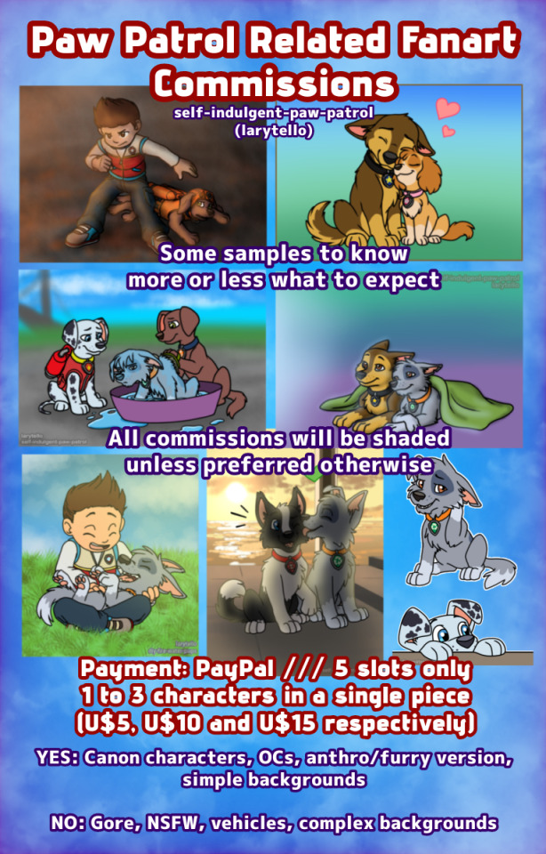
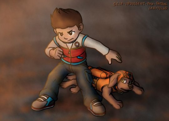
You said yes and it took me a bit but I'm finally opening a few slots only for you people/pups 💜
Could I actually draw the vehicles? Yes, I have the practice from drawing Transformers, Knight Rider and Herbie. BUUUUT my Samsung tablet is literally kicking my ass here and refuses to cooperate, I literally can't work on bigger artworks or take too long in a single piece for lack of storage space - that's why I'm opening these slots in the first place, to be able to afford the fix-up of my desktop computer so I can get back to work properly on bigger projects and teach my online classes in peace. Sadly I still wasn't informed how much it'll cost for them to fix it, the tech guy got sick this week (I did too, argh), so he's still going to take a look at my computer, and whatever money I had, I'm spending on food day by day. Right now as I'm typing this post I have only R$20 in my account, which is a bit less than 5 US Dollars 🥲
Reblogs are greatly appreciated too!
Since I haven't really worked any Paw Patrol art with lighting and shading for real aside from the one of Ryder and Zuma so far to show as examples, under the cut I'll have some artworks that aren't Paw Patrol related but will serve as reference to see how I work lighting and shading when drawing.


#Paw Patrol#Paw Patrol Fanart#Art Commissions#Paw Patrol Ryder#Paw Patrol Chase#Paw Patrol Marshall#Paw Patrol Skye#Paw Patrol Rocky#Paw Patrol Rubble#Paw Patrol Zuma#Paw Patrol OC#Paw Patrol Everest#Paw Patrol Tracker#Paw Patrol Rex#Paw Patrol Liberty
91 notes
·
View notes
Text
Evolution of Homestuck’s Art Style, Pages 1-1550

[page 1, 1434]
Since Act 4 began, I’ve been blown away by the visual difference between this and the earlier comic – there’s been a big shift in style, and huge increase in the use of color. So, re-reading and just looking at the art style, here’s an overview of the changes so far.
[a short one – 2.8k words below the cut + some very beautiful panels. I was limited to 30 images in a post, so would recommend looking up page references for the ones tumblr wouldn't let me include <3]

[page 4, 16]
Act 1 mostly uses sprite art and clean, tidy images; the white background is the dominant color in most panels. Where John is drawn freehand, he’s drawn as close to his sprite as possible, with a thick black outline and blocky shapes. This is often done to give him a more complex pose or facial expression than a sprite would allow (for example, p.16). John’s house is relatively tidy, filled with discrete items that it’s easy to move around and manipulate to create new panels – these are mostly either imported photographs rendered in black and white, or line drawings similar to John’s sprite. Occasional items are drawn in color – some due to their importance (Sburb logos) but some due more to common sense (blood capsules).
John’s captchalogue and strife systems are colored overlays on panels that are still mostly black and white. Full color panels show up when John (or Rose) uses a computer, showing their desktop background, or when John looks or goes outside and observes his neighborhood. Here, his near monochrome, thick-lined sprite stands out against the lineless background (the car and mailbox help soften this for now).

[page 195, 246]
Over the next few acts, Homestuck will develop an art style typified by its lack of outlines and straights, abundance of curves and swirls, use of patterned blocks of solid color to create light and depth effects, and emphasis on motion. Act 1 has the earliest steps towards this – my favorite is page 195, where John looks through his telescope and sees the meteor heading towards him. These styles of sky, clouds, wind, and small animated elements that don’t dominate the panel are all still common techniques in Act 4. The final shot of the meteor cloud in the End of Act 1 flash animation (p.246) – which is almost entirely full color outdoors shots – is another great example.
Act 1 is definitely not dull or colorless, and there's a real charm to its style, but it is overall functional. Panels are designed to give information, show the results of commands, and communicate a change of state from the previous panel – it’s unlikely someone would look at them just for aesthetic value. Act 1 has the closest to an ‘adventure game’ look, as lots of John’s items look like they should be clicked on for more information, and rooms are often rendered in an isometric style. In a narrative comic, this also makes John feel boxed in and stifled by the imposing walls and lack of color. His world is stark, monotonous, and cut-and-paste, somewhere he has been placed instead of somewhere he naturally belongs.


[page 312, 363]
Act 2 stays primarily monochrome, but panels are busier on average. Dave’s room (p.312) has so much going on in comparison to John’s (p.4) that in a video game, it’d be hard to know what to click on first. John’s room has become much busier now that it’s been looted and smeared by imps, which makes it harder to keep the art consistent between different panels and angles. Like John and Rose, Dave’s computer, house exterior, and inventory systems are shown in color. Dave’s living room is monochrome but has a fair amount of color through his brothers’ puppets, while John’s now has imps in harlequin outfits, build grist, and Nannasprite.
Rose is unique among the kids for never being placed on a white background. When she’s first introduced, her room is shown in pale gray to indicate that it’s getting dark in her house. This color is unobtrusive, close to white, and doesn’t feel like it makes the panels more complex. As a wildfire creeps closer, the sky around Rose tints red – a slight burgundy on page 398, and a more dangerous wine red on page 985. The mausoleum is also gray, with a soft lineless background unlike other indoor spaces. Rose is the first beta kid to leave her house entirely and go to a secondary location, heading down to the Skaianet Laboratory on page 840 – a much more visually complex area in which she’s shown against a green background until she goes back to the fire. If there’s any examples of her in a white space, I missed them!

[page 444, 665]
The kids are still drawn close to their sprite style, with occasional variation. Dave’s sprite is shaded in red and yellow on page 444 to represent the ‘sick heat’ he’s trapped in, and he’s shown in red silhouette as he steps onto the roof on page 665. In ‘WV: Ascend’ (p.757), every frame is full color and more detailed than most previous panels, and the kids’ and guardians’ sprites stand out as the only cut and pasted element. The landscapes are changing faster than the characters, which creates a feeling of unfamiliarity and their struggle to keep up with their new circumstances.

[page 248, 558]
The Wayward Vagabond’s panels immediately look different from the kids’. Page 248 is easily the most complex still image up to that point, with the greatest color diversity (four shades in the sky, one in the city, and I think as many as eight in the sand). It’s very different from the blocky blue sky at John’s house. WV has a sprite too, but his is full color, meaning that when he’s drawn freehand he’s drawn without an outline. This makes him feel ‘part’ of the background instead of pasted on top of it, merged with his landscape while the kids are at odds with theirs. The 100-page Wayward Vagabond point of view section is the first extended sequence of full color panels, but by this point they’ve shown up enough that it doesn’t feel jarring.
Act 2 has the first panel where the art itself blows me away. Page 558, with its fiery boat sailing into the sunset, goes harder than any panel that’s come before it entirely in service of the Vaulthalla pun.


[page 760, 840]
Act 3 introduces Jade in the typical sprite style and monochrome interior, but she appears in her windowed garden atrium, so at least half of her first panel is in full color. The exterior of her house is more colorful and prominent than any kid before her, with various colors of clouds and plants; the same is true of her computer, which surrounds her in three-dimensional spinning colors instead of being a two-dimensional screen. Jade’s room is the biggest and messiest yet, as in just two acts the comic is already feeling limited by its ‘character stuck in a room’ format.
[page 225, 986]
This act shows the art style in transition, with even more color and complexity introduced into what are technically indoor panels of the kids, and more excuses found to draw in the softer, lineless style. On page 840, the tunnel Rose walks through is sketched like a sky, when an act earlier it might have been made of simpler, blockier shapes. Page 986 shows a very similar view to page 225, and the new version isn't necessarily more complex but it is more Homestuck, with increased texture and definition in the clouds and a fire moving through layered lines of color.
Just like in Act 2, ‘Years in the future…’ pages lead the charge with the changing art style. Pages 924, 1005 and 1035 provide lush post-apocalyptic landscapes with a beauty that isn’t seen on present-day Earth – even Jade’s island on page 1080, clearly designed to be visually interesting, doesn’t have quite the liveliness and definition of the post-apocalyptic pages (in my opinion).


[page 1051, 1147]
Act 3 also introduces the aesthetic vertical page. Previously, vertical pages are used occasionally for their aspect ratio, showing a book or the entirety of John’s house. Page 1051’s art isn’t giving information or showing a changed state, but stands out as an impressive visual and a pause for breath in between panels that do give information. Page 1147 is similar, and I believe it’s also the first time a beta kid is drawn in the lineless style (with detail to their form, not just a silhouette). This page comes right before the end of act flash, showing the final form the art has now achieved.

[page
Besides the monochrome sprite art associated with the kids’ houses and the lineless style associated with the outdoors, Act 3 introduces a couple more styles. One is the scribble style, first introduced with WV’s Can Town fantasies and murals, and then scattered throughout Jade and the exiles’ scenes in Act 3. Some panels in this style are explicitly intended to be drawn or imagined by an in-universe character, while other times they represent a strong emotion or sudden interruption.
The other new style is the color-adjusted jpeg, seen in Prospit (p.1029) and the dark kingdom (p.886), where the background is composed of externally-sourced images that have been manipulated and recolored. The over-saturation of a single color makes the location recognizable without need for its own distinctive art style – Prospit is entirely gold or yellow, the dark kingdom is entirely purple, and the Felt’s mansion is entirely green.

[page 1236, 1337]
The Intermission is made almost exclusively in this style, which adds a lot of detail to backgrounds while sacrificing some distinctiveness. While sprite art is used, the sprites themselves are entirely black or green, so they complement their environment the same way John complements his Act 1 house. By using images of a mansion’s interior as panel backgrounds, the Intermission is arguably more ‘realistic-looking’ than the representational art and medieval castles of the Acts, which ties into its grittier and more grounded tone.
With its goal of a fast production pace in advance of a more complex Act 4, there aren’t many artistic standout pages in the Intermission. A rare exception are the pre-city wasteland panels, such as page 1236, which blend the jpeg technique (for the stars and planets) with a lineless alien landscape of pleasantly rolling dunes. Pages 1188 and 1337 also blend these styles, but this is the extent of the lineless panels until Slick enters the safe.
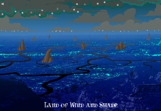
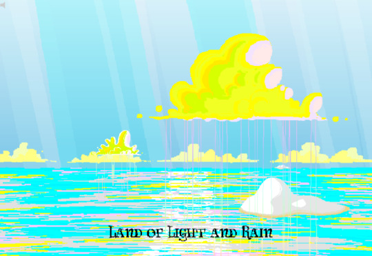
[page 1358, 1407]
Act 4 introduces the Land of Wind and Shade (LOWAS) and the Land of Light and Rain (LOLAR), two planets with distinct designs in the lineless style where John and Rose’s scenes now exclusively take place. Both are stunning – LOWAS is mostly dark blue with gray clouds, and a focus on bioluminescence through its mushrooms and fireflies, while LOLAR is mostly white landmasses amid a sea of pastel blue, pink and yellow. Since Act 1, Homestuck has taken care to set its animated pages primarily outside the kids’ houses, with the notable exception of page 253’s walkaround. This is likely because color makes flash pages more interesting to watch and easier to interpret – but character or plot developments have still been the focus. Page 1407, which introduces LOLAR, is the first flash with a primarily aesthetic function.

[page 1446, 1457]
In Act 4, panels that might have been standouts in previous acts are now commonplace, such as John answering messages on page 1391-2. Use of brown and yellow keeps the exiles’ pages visually distinct from John and Rose’s, but they’re no longer a clear upgrade. This helps the comic skip back and forth between John, Rose and the exiles without a narrative transition, as the art change is less jarring. Pages that take place in Dave’s monochrome room are now the outliers, while Rose and John’s sprites (and Dad’s car) really feel like relics of previous acts. Even with John’s new full-color suit and Rose’s land including a lot of white, their stark lines and lack of shading don’t merge well with their landscapes and always become the focal point when these sprites are used.
As such, there’s more examples of John and Rose in a lineless style, which feels long overdue and catches them up with changes that have already happened. Fully lineless panels tend to be very well composed with clear artistic intent; easy to interpret and pleasing to look at. They often represent movement even when not animated, so work well for transitioning to or away from a character. Sprite panels, on the other hand, have much lazier composition. Messes don’t get cleaned up, and panels show irrelevant objects often half-inside the panel and half-outside, so even when they’re communicating clearly they’re often less pleasant to look at – I find this true of AR’s introduction in Act 3 (p.1100-1111) and all the Dave and Jade scenes in Act 4. Page 1446, for example, features the first prototyping of Dave’s sprite, but it’s hard to focus on the crow-sword’s move through the room with so much else in the way (in contrast with page 185, where the harlequin doll is clearly in focus for its prototyping).


[page 39, 1523]
As a final comparison to illustrate this change, let’s look at page 39 side by side with page 1523. In both cases, a character is typing in Pesterchum. The reader has already seen the kid’s location and nearby possessions, so the images do nothing more than illustrate that the character is on their computer, while the meat of the page is in the Pesterlog.
On page 39, this is situated between two John panels where he takes different actions (assigns Hammerkind and captchalogues a book), so page 39’s image feels necessary to the sequence. On page 1523, this is immediately followed up by another image of Rose, still on her computer, and one that feels far more dynamic. Rose gets a facial expression and sitting position that give her some character, the close-up shot feels intimate for an important conversation, and the background is still present through the ocean behind Rose and the shading from her umbrella. So while there’s nothing wrong with page 1523 (which does successfully re-establish Rose after some pages away from her) or with the sprite style in general, the upgrades to other areas of the art do make the sprite pages feel weaker by comparison.

[page 1524]
Whether intended or otherwise, the kids’ houses being the only monochrome, heavily outlined spaces while all other locations are full color and mostly lineless, is really evocative of the comic’s title. The first full-color panel is John’s desktop on page 24 featuring the Slimer background he made himself, and later his computer becomes a gateway to the Medium where he can access a whole world of color designed just for him. In contrast to being ‘stuck’ in defined dimensions and copied images, the kids are entering a world of beauty, motion and art for its own sake. The exiles’ panels introducing the lineless style and the kids’ following reflects the exiles guiding the kids into the Medium and towards their eventual quests. LOWAS and LOLAR’s fantastical designs add a sense of magic to the story, bringing it away from games and technology and towards more esoteric, unknowable forces. Their unique designs compared to the kids’ similar-styled houses recalls Rose and gallowsCalibrator’s mentions of Sburb’s ‘flexible mythological framework’ (p.440) or ‘HYP3R FL3XIBL3 MYTHOLOGY’ (p.1524), which apparently extends to the level of art style.
Personally, I think the swirling, lineless art style Homestuck has developed is very pretty, but does take away the ‘point and click game’ feeling of Act 1. It’s interesting that the art style develops alongside the reader-command format – Act 1 is almost entirely reader commands, while Acts 2 and 3 mix reader commands with author-driven exile commands and ==> pages, and Act 4 has already seen the reader suggestion boxes close for good. I think the question of ‘is Homestuck a game?’ is still relevant, but needs a different answer in Act 4 compared to Act 1. The level design of LOWAS, LOLAR, Prospit and the dark kingdom is excellent, but they’re for running around and fighting, not standing still and clicking. The genre has changed, and the characters’ roles in the game are being reconfigured alongside the players’ and narrators’ roles.
So, how will Homestuck’s art develop from here? My guess is that there will be a decrease in GIFs and an increase in still images, as the new style is likely harder to animate and better at conveying motion without animation. Act 4 is setting up to bring Dave and Jade into the Medium as quickly as possible, at which point there will be five planets (including post-apocalyptic Earth) each with their own distinctive designs. Once this happens, there will be no need for scenes inside the kids’ houses, and the comic will be able to eliminate the kids’ sprites altogether (or at least re-design them with more color and fewer stark lines, more similar to the trolls’, exiles’ or Felt members’ sprites). Dave and Jade’s sprites being prototyped may further affect the Medium, perhaps affecting the light and dark kingdoms as planets as well as just their agents. Finally, I think there will be a focus on how the kids’ actions physically change the landscape of their planets, as this has already been the case with their modifications to their houses.
[page 1395]
#homestuck#analysis#i like to look at it! it's a beautiful comic there's a whole bunch of panels id get framed for my wall#if i had money or a house!#act 3 also doesn't have a super defined identity so thinking abt it as a transitional act for the art is cool to me#also wish id thought a lil more abt facial expressions and emotions and how they are represented in sprites#but im trying to keep posts short and simple and not let them get away from me. so. i will stop here <3#chrono
22 notes
·
View notes